A Better Microwave Oven UI
What should a power user's microwave oven interface look like? Not like my panasonic one

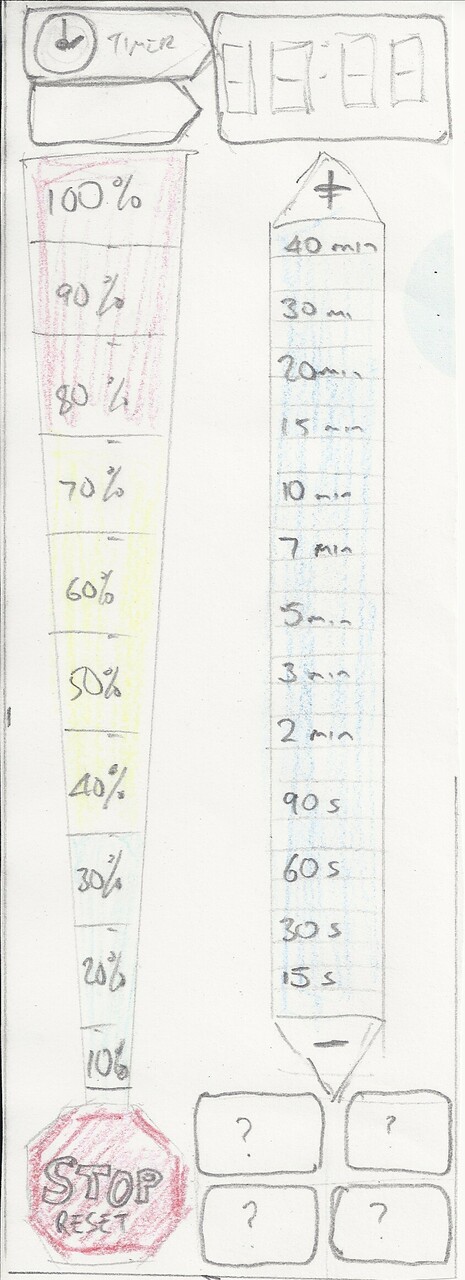
Two vertical touch strips, one linear power 10% to 100%, the other logarithmic time. Touch the power to set power, touch the time to set time and start the cooking. The controls have lights behind to show current power setting and remaining time. Any time, just touch either control to change the power, or increase or decrease the time. + - nudge button on the time.
Comments